Streamline and centralise all your financial transactions.
Let's go

Overview
Paysure's platform struggles with inconsistent design across its apps, confusing users trying to connect them to the main Paysure brand. This inconsistency leads to varied user experiences and navigation challenges, especially with similar flows shared across the different platforms, differing button styles, and calls-to-action. Ultimately, these design disparities compromise both user satisfaction and the unified brand image of Paysure.
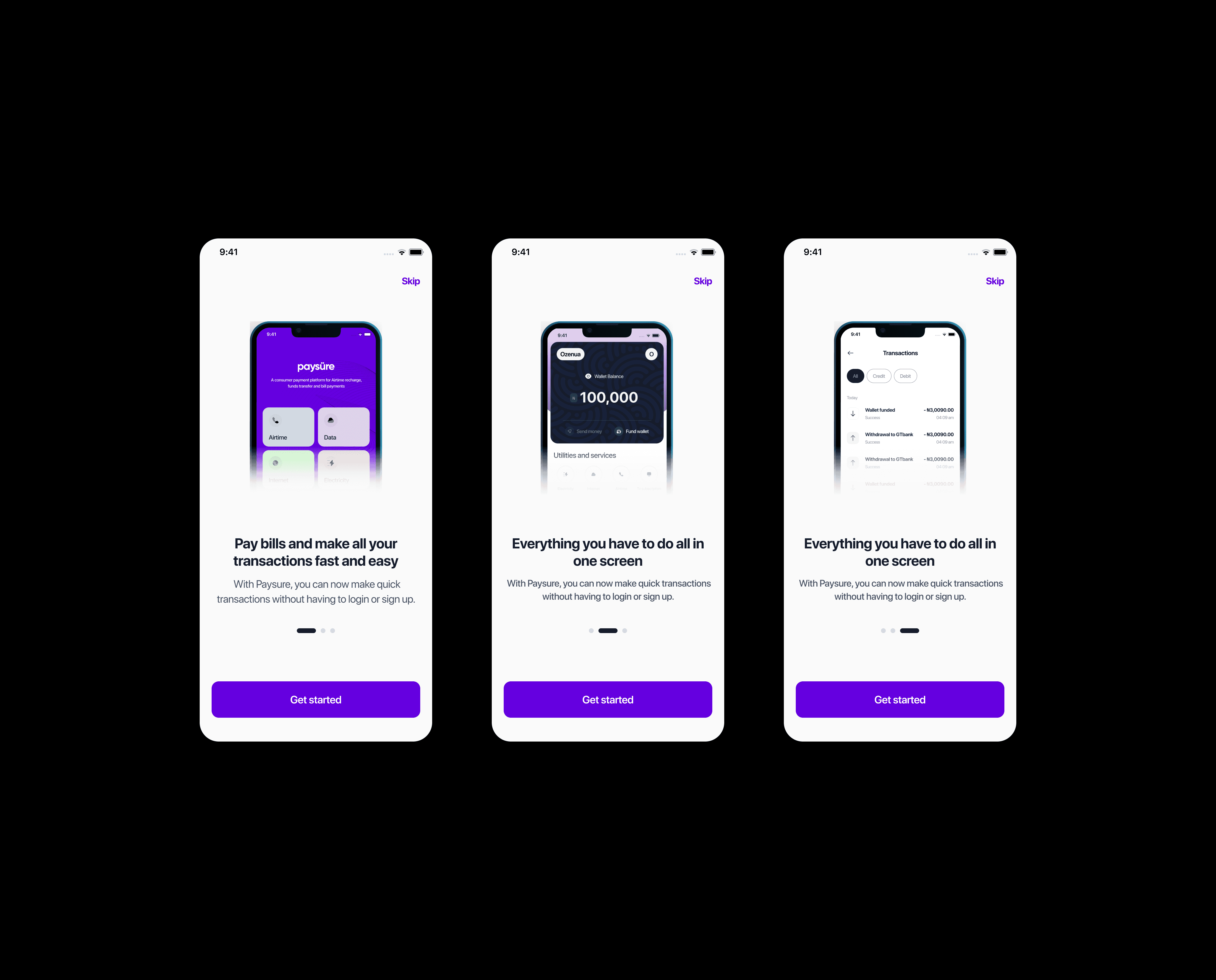
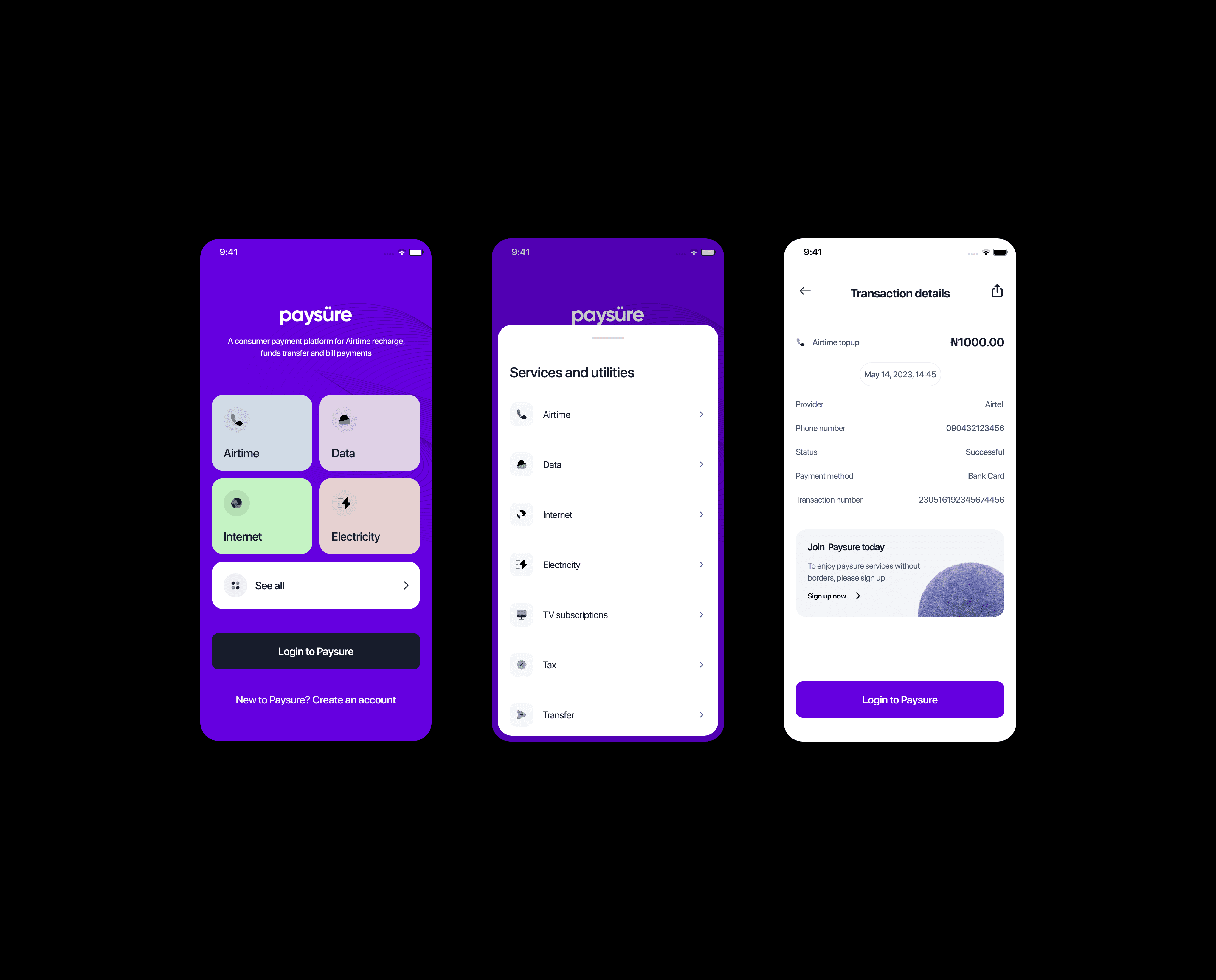
To address Paysure's design issues, a unified redesign is needed. This involves creating consistent colors, fonts, and design elements across all apps to align with the Paysure brand. By standardizing navigation and interactions, users will find the platform more intuitive. Ensuring uniform CTA buttons minimizes confusion and aids user decisions. Ultimately, this approach enhances user experience and strengthens Paysure's brand consistency.
(Details)
Client
PaySure ™
Type
Web application, Mobile app, Website
Year
2023
See work
Approach
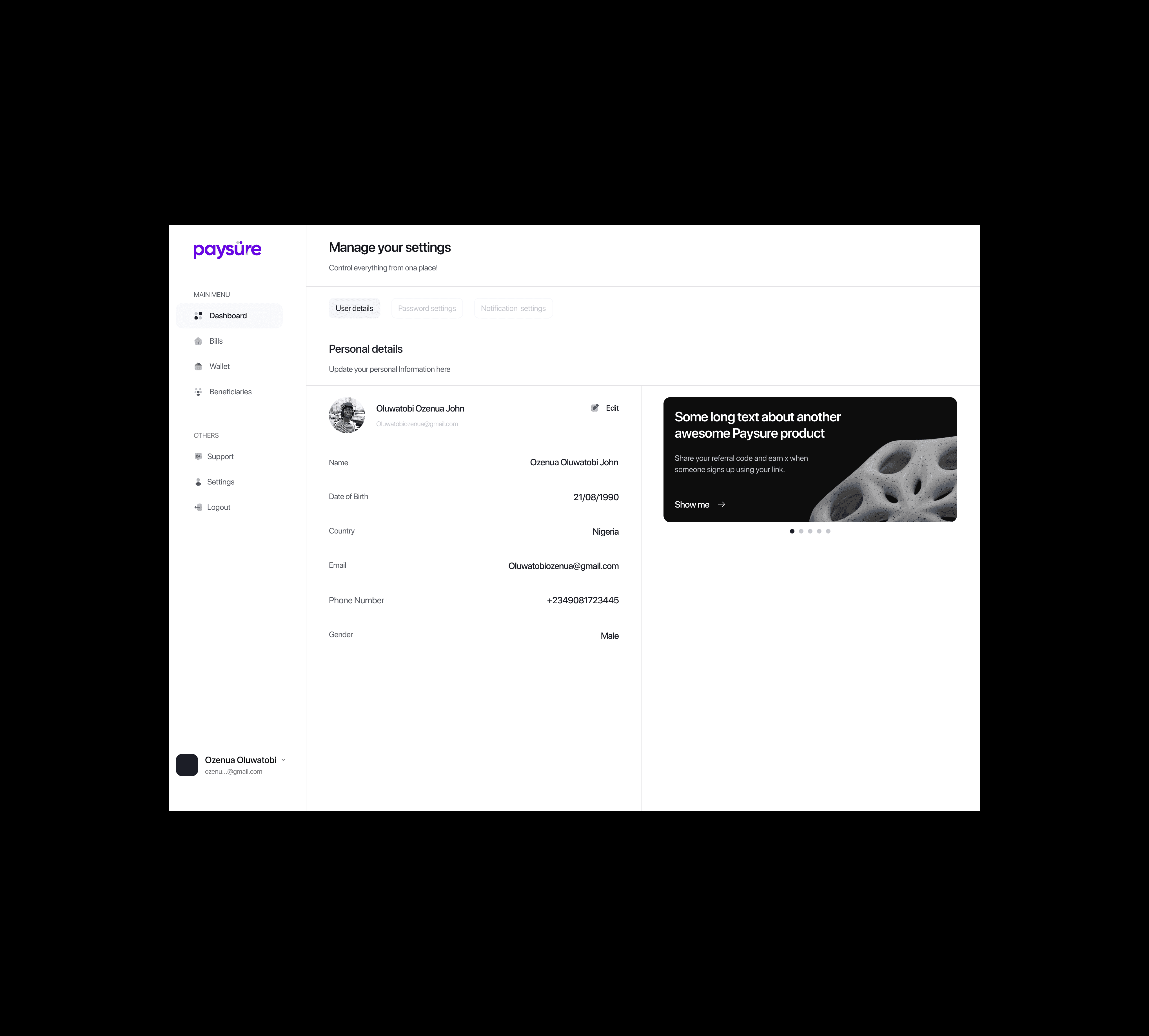
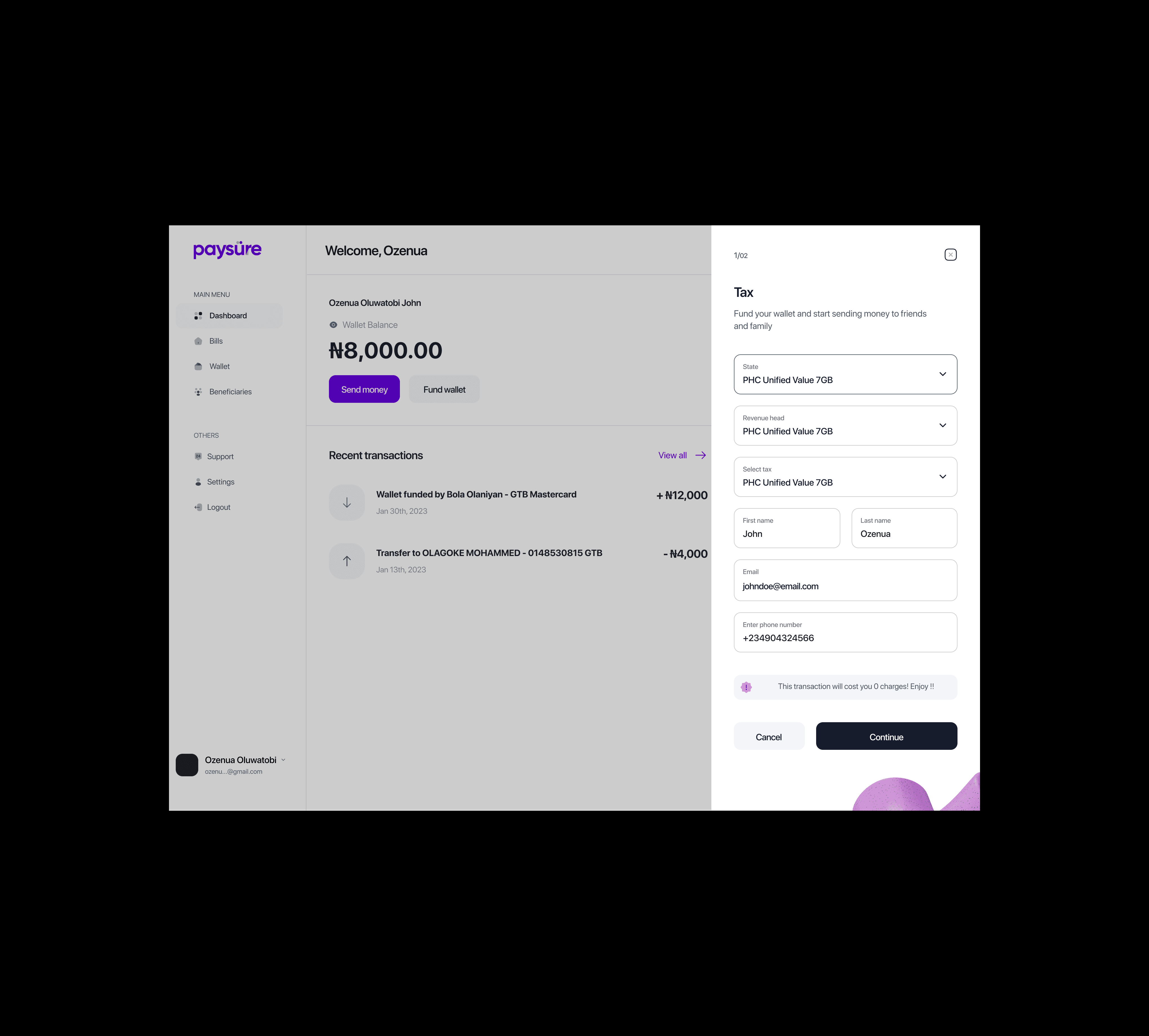
After researching and testing the platform, we identified key issues and created solutions using a single checkout flow as a use case. We implemented clean typography, consistent spacing, and reusable components for navigation, inputs, cards, and popups, ensuring a cohesive design system.
By standardizing navigation and buttons across products, we improved visual consistency and adaptability for both new and existing users. Post-launch testing with seven users confirmed a smoother, more enjoyable experience, validating our user-centric approach and inspiring further enhancements.
Let's work together